
A forest plot is a graphical representation of the results of multiple scientific studies addressing the same question, often used in meta-analyses to illustrate the relative strength of treatment effects across various studies.
Clinical Utility of a Forest Plot
Forest plots are widely used in evidence-based medicine and systematic reviews to help clinicians interpret study results effectively. Their utility includes:
1. Visualizing Treatment Effects
- They provide a clear visual summary of the effect sizes from multiple studies.
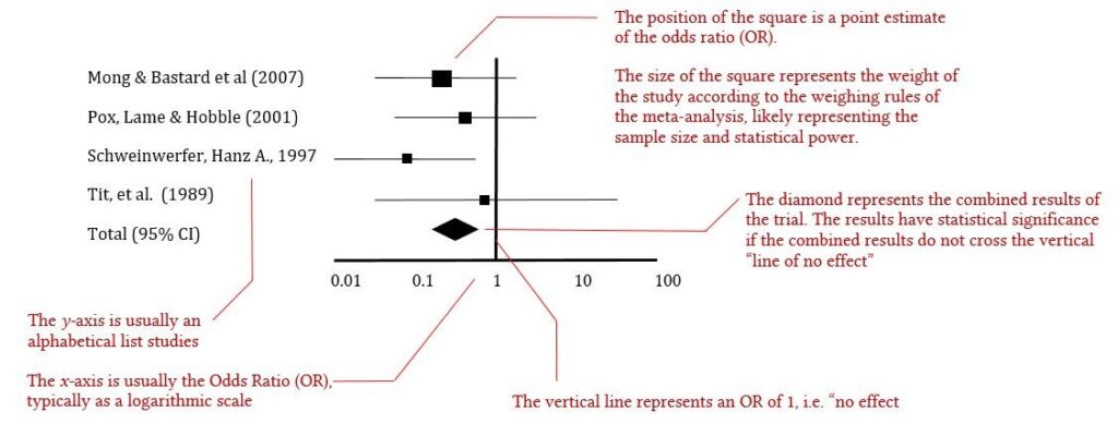
- Each study is represented as a point estimate (often an odds ratio, relative risk, or hazard ratio) with a confidence interval (CI).
2. Assessing Consistency and Heterogeneity
- Heterogeneity refers to variations between studies. If the confidence intervals overlap significantly, the results are consistent.
- A statistical measure, such as I² statistic, may be included to quantify heterogeneity.
3. Comparing Effect Sizes
- The plot includes a vertical line (typically at OR/RR = 1), which represents the null hypothesis (i.e., no effect).
- Studies with confidence intervals that cross this line suggest no statistically significant difference between treatment and control.
4. Determining Overall Evidence Strength
- The diamond shape at the bottom of a forest plot represents the pooled effect estimate from all studies.
- A narrow diamond suggests stronger evidence, whereas a wide one indicates greater uncertainty.
5. Supporting Clinical Decision-Making
- Clinicians can quickly assess whether a treatment is beneficial and by how much.
- It helps in weighing risks versus benefits, especially when multiple studies provide different results.
By integrating forest plot analysis into clinical decision-making, GPs can adopt evidence-based strategies that improve patient outcomes.
Example Interpretation of a Forest Plot
Let’s consider a hypothetical meta-analysis. A forest plot would typically include:
- Study Names (Left Column) – Lists individual studies included in the meta-analysis.
- Effect Sizes (Middle Graph) – Each study is represented by a square (point estimate) with a horizontal line (confidence interval).
- Reference Line (Vertical Line at 1.0) – The line of no effect. If a study’s confidence interval crosses this line, its effect is not statistically significant.
- Pooled Effect (Diamond at the Bottom) – The combined effect estimate of all studies. The width of the diamond represents the confidence interval.
Interpreting the Plot
- If most squares are on the left of the line (e.g., OR = 0.75, 95% CI 0.65–0.85), the intervention reduces risk.
- If the diamond is entirely to the left, the result is statistically significant.
- Heterogeneity (I² statistic) – If high, results are more variable across studies.